
In this Blog, we’ll guide you through connecting Microsoft Fabric’s KQL Database (Eventhouse) to Power BI Desktop and creating real-time, interactive visualizations using the Yellow Taxi data. Whether you’re dealing with live event data or large datasets, Power BI helps you turn raw data into valuable business insights.
Why Use Power BI with KQL?
Microsoft Fabric’s KQL databases are designed for high-performance queries over streaming and historical data. However, raw data alone may not be directly actionable. This is where Power BI comes in.
By connecting Power BI to your KQL database, you can:
- Visualize real-time data with interactive dashboards
- Create reports for operations, monitoring, and decision-making
- Build interactive visualizations using both DirectQuery and Import modes
- Share insights with your team using Power BI Service
Whether you’re working with live event data or large analytical datasets, Power BI simplifies understanding and acting on your data.
Prerequisites
Before getting started, make sure you have:
- Obtain a Microsoft Fabric tenant account with an active subscription. Refer Lesson 3 Getting started with Microsoft Fabric.
- Verify that you have a Microsoft Fabric-enabled Workspace set up and ready for use. Refer Lesson 4 Fabric Workspaces and how to create one?
- Power BI Desktop (latest version)
- A KQL database (e.g., Eventhouse) containing data (e.g., like we loaded YellowTaxidata via Eventstream) Refer Lesson 58 – Getting started with Kusto Query Language (KQL) and Lesson 57 – Create and manage Event Streams with Microsoft Fabric
Steps to Create a Power BI Report from KQL Database
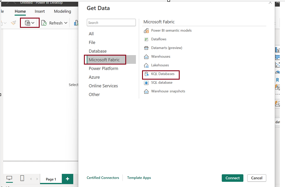
Step 1: Launch Power BI Desktop and Connect to KQL Database
- Go to Home > Get data >
- Select KQL Databases.
Step 2: Choose your KQL database
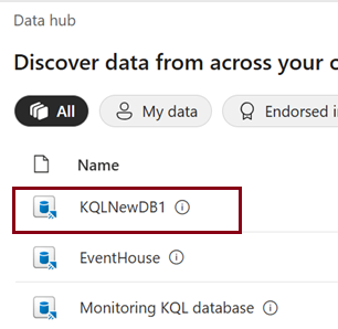
Choose the table data you want to get insights inside Power BI
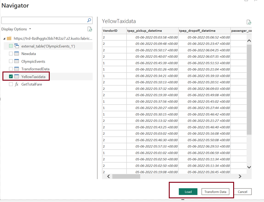
When working with real-time data, including datasets like the Yellow Taxi data, you often deal with anomalies like duplicates, missing values, or even incorrect formats. In real-time data streams, duplicates are especially common, as multiple sources or events can generate the same records. So, it’s essential to apply data transformations to clean and normalize the data.
Common transformations could include:
- Removing Duplicates
- Handling Missing Values
- Data Type Conversions
- Timestamp Adjustments
- Outlier Detection and Handling
Once transformed, the data will be much cleaner, helping in more accurate analysis and downstream processes like reporting, dashboards, or machine learning models.
Once you choose Transform data You’ll be asked to choose your connectivity mode:
Choose Connectivity Mode – Import vs DirectQuery
Import Mode
- Best for small datasets
- Data is copied into Power BI
- Great for offline access and faster visuals
- Not real-time
DirectQuery Mode
- Best for large or real-time datasets
- Data is queried live from your KQL database
- Ideal for real-time dashboards or operational reporting
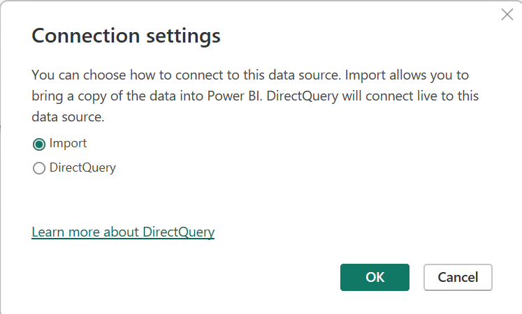
Note: For Eventhouse or streaming use cases, choose DirectQuery.
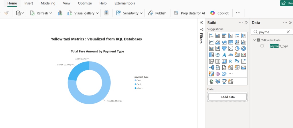
In this example, I used DirectQuery mode to connect Power BI to the YellowTaxidata table in the KQL Database (Eventhouse). I applied transformations to the PaymentType column to convert numeric codes into readable payment method names.
Using the transformed data, I created a donut chart to visualize the distribution of payment methods across Yellow Taxi trips. This provides a quick snapshot of how riders are paying whether by credit card, cash, or other methods.
Method 2: Using KQL Query Dataset in Power BI
KQL Query Dataset
In Microsoft Fabric, a KQL Query Dataset is a reusable dataset that is defined by a Kusto Query Language (KQL) query, instead of pointing directly to a full table.
Instead of visualizing an entire table with all its rows and columns, you write a custom KQL query to pull exactly the data you want filtered, transformed, summarized and then save that as a dataset.
This dataset can then be used in Power BI.
Preprocessing Data: KQL queries allow you to preprocess and clean data before it reaches Power BI, ensuring that only relevant data is included in your reports.
Complex Analysis: Use functions like summarize, join, and extend to perform complex data analysis directly within the query.
Real-Time Data: By using DirectQuery mode, your Power BI reports can show real-time results from your KQL queries, making them highly interactive and up to date.
You don’t need the entire table just a filtered slice of it.
The below Kusto Query Language (KQL) query analyzes the Yellow Taxi dataset by summarizing the number of trips per hour for each day between June 1 and June 10, 2022.
YellowTaxidata

| where tpep_pickup_datetime between (datetime(2022-06-01) .. datetime(2022-06-10 23:59:59))

| extend pickupDate = format_datetime(tpep_pickup_datetime, "yyyy-MM-dd"),

         hourOfDay = datetime_part("hour", tpep_pickup_datetime)

| summarize tripCount = count() by pickupDate, hourOfDay

| sort by pickupDate, hourOfDay
This query gives us a clean and structured result showing how many trips occurred every hour for each day in the specified time window. Now, I’m loading this query result into Power BI to create a interactive report.
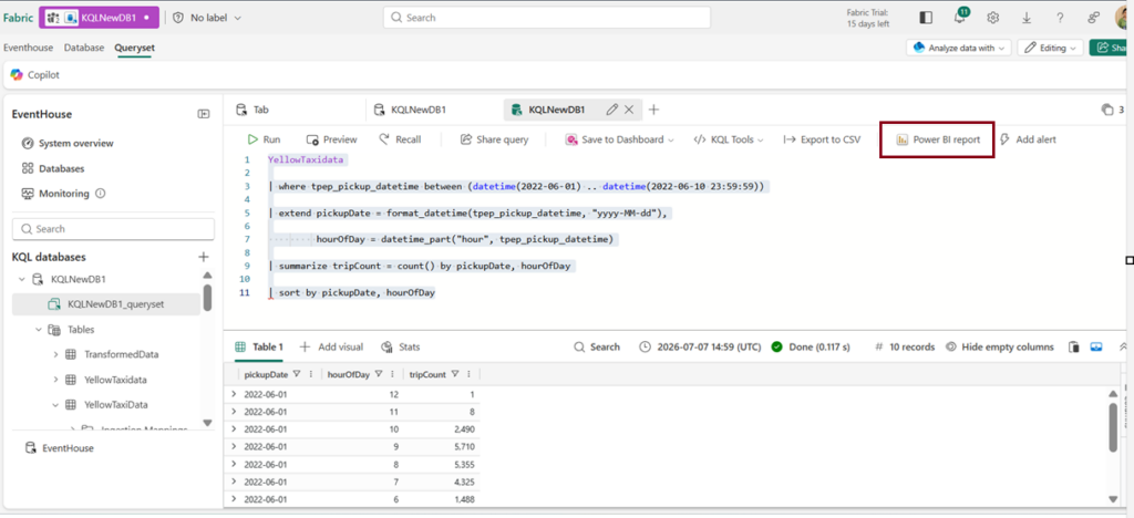
Click on “Power BI Report”.
Below sample Power BI report shows “Number of trips per hour in a day”. Here we have a slicer to choose specific Pick up date.
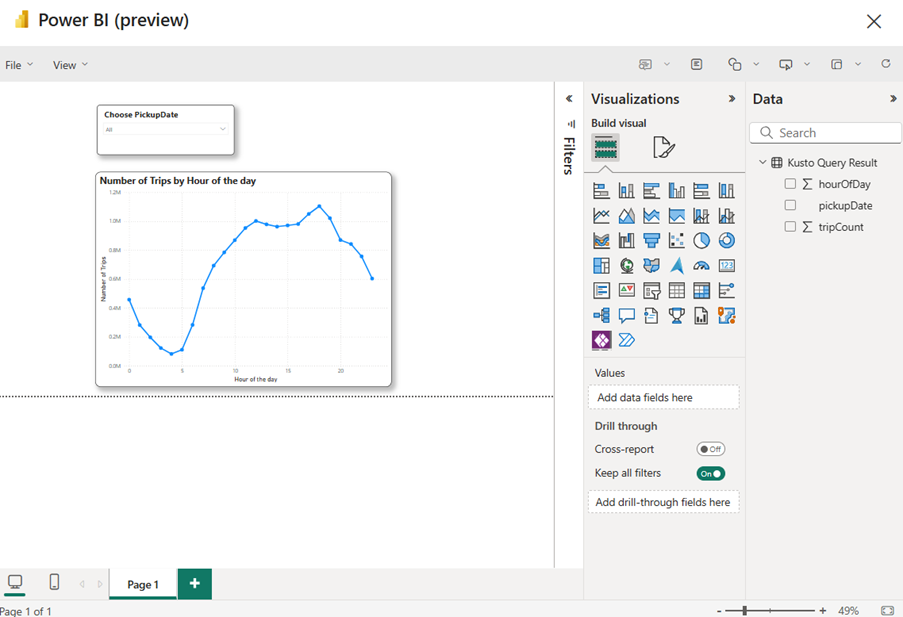
Click File and save the report.
Method 3:
Click on the KQL DB inside Eventhouse and choose the table data you want to visualise in Power BI and click on the (…) next to table and click on Power BI.
By connecting Microsoft Fabric’s KQL Database to Power BI, you unlock the power to turn streaming or historical data into actionable insights with just a few clicks. Whether you’re using direct table connections, KQL query datasets, or pre-cleaned data, Power BI makes it easy to build dynamic, real-time dashboards tailored to your business needs.
Conclusion:
In this blog, we explored multiple ways to bring data into Power BI, applied transformations to clean and built visualizations like donut charts and hourly trip graphs. These tools empower you to monitor patterns, spot anomalies, and make informed decisions all in real time.
| Tags | Microsoft Fabric |
| Useful Links | |
| MS Learn Modules | |
Test Your Knowledge |
Quiz |